Posts

Business Cards

Image
Making business  cards went better than  I  excepted . I really  enjoyed this project  because it gave me a  lot of freedom to create  them however I please.  My favorite cards are the first  two because of the  color gradient. This assignment helped me a lot because I know I will use these skills in the future. 

Photoshop photos Ideas for somewhere project

Image
  I think that it would be very hard to photoshop myslef into a rollercoaster. The lighting and the different cutouts would make this very difficult.  This is my inspiration behind my somewhere project. I knew I wanted to do something with soccer but when I saw this, it sealed the deal.  This one made be bust out laughing. Everything is perfect, the scene, the facial expressions, and the photoshop skills. Best one ive seen in a minute.  This was the coolest illusion that I saw. This makes the toy car feel so real and powerful even though a man is behind it. 

Propoganda Poster

Image
       In this project, we needed to use Adobe Illustrator to make a poster with a photo of us. For me, this was one of the most difficult projects of the year because there are a lot of details and steps that if you miss, will make the photo worse. This piece took me about 3 hours, but that was mostly frustration and watching the videos.      I decided to stick with the theme of living life and enjoying what you have left. When I was younger I used to stress a lot over the smallest things like sports matches or even video games. As I grow up, I realize that life alone is  stressful enough, why add more stress. Most of the things that you stress about  won't even matter a few months after. 

Logo

Image
  Completion time: 2 hours      This piece of art was  probably my most creative and most favorite of the whole year. I started designing my logo on a piece of paper with other designs. First, I created a crown because this type of crown has been my favorite since a kid. I have always wanted to get a crown like the one above tattooed. Randomly I  saw that if I added a smile and two eyes, it would look like a 1 of 1 smiley face. I like this a lot because it means something to me and it looks good.      This was very fun and easy to create. The hardest part was assembling all the little pieces together. This was a little tricky because they eyes would have to match up or otherwise it would have looked horrible. What I like the most about this is that it is very easily  customizable. The three bottom logos are three different color combinations that I chose. I chose colors that are very vibrant because it goes with the very wild logo. 

Caligram

Image
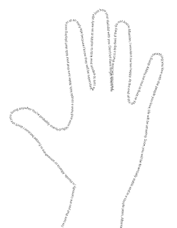
  Artist Statement: I decided to create my calligram a  hand because for me it means to calm down. As we are growing up, time goes by so fast, which is the whole meaning behind my hand. With this project, I wanted to let people know that it is ok to stop sometimes and relax. People need to enjoy every second of life so when something is not going your way, just stop and relax. As I create this piece of art, memories come up of when I was younger and stressing over things that did not matter 6 months later. Life is so fast that people need to do what makes them excited and happy with life. As I grow older, I understand that life is hard and difficult but I want this piece of art to let me know that not everything is going to go your way, so relax.  My Letter: Dear Bexhet or Jon or whatever your name will be,             Before we start, I hope that you never forgot where you came from and your goal. You should be 39 somewhere living life or maybe you're dead, who knows. Even though

Canvas Project

Image
  Jon Shehu      For my project, I decided to go with a view from my home city of Vlore, Albania. When I learned that we were going to this type of assignment, I knew that this is what I wanted to do. This started off very easy but it became very hard as this was one of the first times I had ever coded. In this project, I included a lot of different shapes, bezier curve and quadratic curve. My favorite part of this, is that the final project looks a lot like my inspiration and thats what I wanted.     This project took me about four hours because there were times where I might have have been halfway done and I had to restart because of mistakes. I have proud of how my project came out but it could have been way better. In my  opinion, I was missing some gradient colors on the mountains and different colors for the water and sky.  Insiration: Full Code:  <!doctype html> <html> <head> <meta charset="UTF-8"> <title> -.-.-.-.-.-.-.-.-.-.-.-.-.-.-.-.-

InDesign tools for beginners

https://www.youtube.com/watch?v=AshfNo-i8Ws  In this video I learned about the smooth pen tool. Now this tool is used to smooth lines that you drew. It is very easy to find and use. When you left click on the pen tool, options will open up and smooth tool is one of them. To use it, all you have to do is left click and drag on the line that you want, and it makes it look smoother and so much better. https://www.youtube.com/watch?v=0eqhUFRlvgI In this video, the thing that i learned the most was how many options the text settings had. It had the options like picking the distance between characters, changing the horzontal and vertical scale. This is very nice because it gives the creator the ability to create whatever type of text they desire. https://www.youtube.com/watch?v=pTlkmCq7Q1s In this video, the tool that interested me the most was the artboard tool. This changes the artboards size and orentation to your liking. It has preset sizes but you can also drag from the corners of the a